
Below are samples of the standard reports provided to participating institutions, using actual data for a fictionalized institution: NSSEville State University.
Sample Reports
FSSE Interactive Dashboard Reports
FSSE staff have been hard at work creating new reports and resources so that you can make the most of your FSSE administration. These efforts have resulted in reporting that is instant upon administration launch, interactive, and easy to disaggregate. As these changes have happened over time, the use of new platforms and tools became necessary. As we continue to grow and expand available resources, your data and results may feel hard to find. See our page on Locating Your Data & Results to find explicit directions and answers to frequently asked questions about how to locate your data and results by administration year.
New Qualtrics Reports
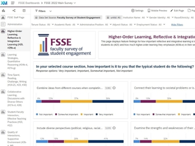
In 2022, FSSE moved to a new Qualtrics-based platform for registration, customization, administration, and reporting. Qualtrics reporting dashboards grouped by content areas, and filters allow for disaggregation by faculty identity characteristics and employment characteristics. These results are instantly available as soon as an administration launches.
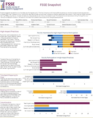
Tableau Reports
In 2021, we created institution-specific, interactive Tableau dashboards as a replacement for the former static reports. Filters allow for disaggregation by faculty identity demographics, employment characteristics, and selected course characteristics. Results can be viewed for administrations back to 2014.
Description of the video:
Hey everyone, I just wanted to give you a quick tour of the new 2021 fussy interactive data visualization reports. Now these are a little bit different than what you might be used to seeing the kind of static Excel and PDF reports in the past. But I hope they give you a lot more value than you're used to getting. Here on the left, I'm showing you the institution interface where you sign in and get your download, download your data and reports for Nessie and fussy. And this year you'll see it's a little bit different over here on the right side with the online report, you're going to have a link that says fat Bessie Tableau dashboards. I do want to note this isn't just for institutions that participated in 2021. These dashboards go back until 2014. So even if you weren't a recent participant, you can still get access to these dashboards. So you can click the fess II Tableau dashboards link. And I'm not going to click this because it's an actual school, but it'll bring you to a page that looks like this on the right. So this is the guide to report seamless kind of as a place to allow you to navigate, to see all the different things at once because there's an awful lot here for you to see. So take your time. But basically these little purple rectangles over here, our buttons to different reports for you. So I'm going to show you a couple of these, but there are some things to keep in mind that I've noted over here. So there's a little home button at the top of each of these dashboards. That home button will bring you back to this navigation page. You're also going to be able to see tabs across the top with names and the different parts you can navigate by the tabs. But it might be easier to come here. Because when you roll over you can see what item numbers from the survey are on the dashboard. So if you're looking for a particular number, you can find it by doing the little rollover here. I also want to note that the item numbers and a description of the items on dashboard page you're going to be included at the top of each page and a little paragraph. What's possibly most exciting about these new reports are the options you're going to have for filtering. And I'll show you some of those when we look at an example. But this is going to allow you to look within, at different types of faculty on your campus and faculty teaching different types of courses. Either all of your years combined, if you have some small numbers are small institution or looking at your years administrations over time. So the filters are going to be a really cool addition to looking at your fess II data. Most of the dashboards are going to have item level results where you can see counts and frequencies of the different items and little bar charts here to give you a little bit of a visual. But they're also going to be dashboards that have these comparisons where you can look at a single measure across different types of faculty. So you can both look within the faculty experience with your different filters, or you can compare the faculty experiences between different categories. So the different dashboards, we'll look a little bit different depending on the types of items, but those are kind of basic operations across all of them. So if you want to look at one with me, Snapshot Report, it's going to think for a little bit. I'm not using a particular schools data, I'm using our entire dataset, so it's a little bit slow. But what you see here is what used to be our fess II snapshot, seas to get a snapshot report. All of that information has now on this report. The difference now is that you can do these filters to look at the snapshot report by different types of faculty and different types of course characteristics. I would encourage you to start with the administration year. So as I said, this goes back to 2014. So all of the data that you have since 2014 will be included here. You may not want to combine all your years. You may just want your most recent year. There's always going to be an Apply button. And then you can pick any sorts of other characteristics that we have of your faculty. And I, unfortunately, yes, for these diversion bar charts, there is something wrong with the x-axis here. That's something that our Tablo people are working on. Something just as rendering rate, but we'll get that fixed as soon as we can. I didn't want that to hold up. The great information that you can receive from these reports. Hovering over will give you a sense of the numbers you're counts, the percentages when appropriate, kind of means or standard deviations. But I'm going to go back to the homepage. I'll show you another. So the snapshot report is a report that you used to get, used to get a large table of frequencies and descriptives. We've now kind of broken that into pieces depending on content area. And so you can hover over and find a content area that's important to you. Perhaps you're interested in looking at high impact practices, so I'll go to that high-impact practice report quick. See some item level information about faculties, importance of student participation. And then down here you can see faculty participation, whether their supervisors are mentors for these different kinds of activities. Service Learning has a different stem, asking, how many of their courses do they include a service learning component. But just like you can filter by year, full-time, part-time, race, ethnicity, maybe discipline if you're looking at that sexual orientation, academic rank, gender identity, all those sorts of things. You can make comparisons, but not all of them, but most of these here. So if you wanted to live by racial ethnic identification in just change the selection and all of these will then show you differences by racial, ethnic identification of your faculty. So hopefully that's more useful to you in diving into your data. The kneeled static reports on so that information plus mourn was in your frequencies and Descriptives. The respondent profile we also made a dashboards for. Before I get to that, I'll say we're working on the topical modules and your disciplinary area report. Those should be available this fall. But let's take a look at the quick identity graphics page. Now, identity demographics is important to look at. Let's make sure your respondents are roughly similar to the actual population of your faculty on campus. So you'll be able to see the proportion of faculty by different racial, ethnic groups, the different demographics we have employment status. There's another dashboard for their course characteristics. So all in all, a lot more information to go through. It might be hard to find things that you are looking for. Please contact with Feste team. We'd be happy to help you interpret your dashboards or find information that's missing or help you make the best use of your data.Static Reports 2013-2020
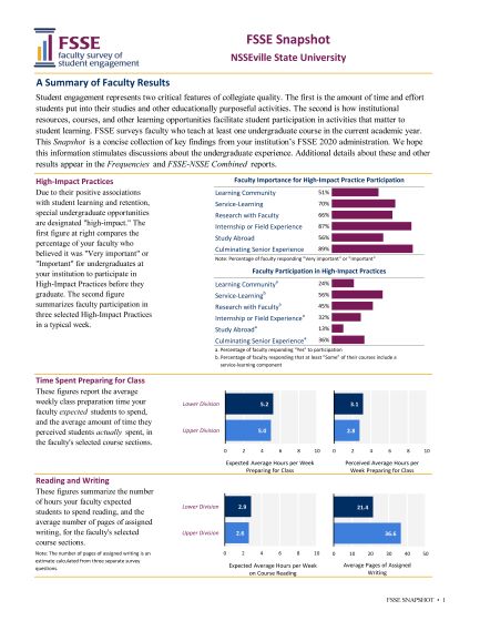
FSSE Snapshot
The Snapshot report is a concise collection of key findings from your institution's FSSE administration. Additional details about these and other results appear in the reports referenced throughout.
FSSE Snapshot Report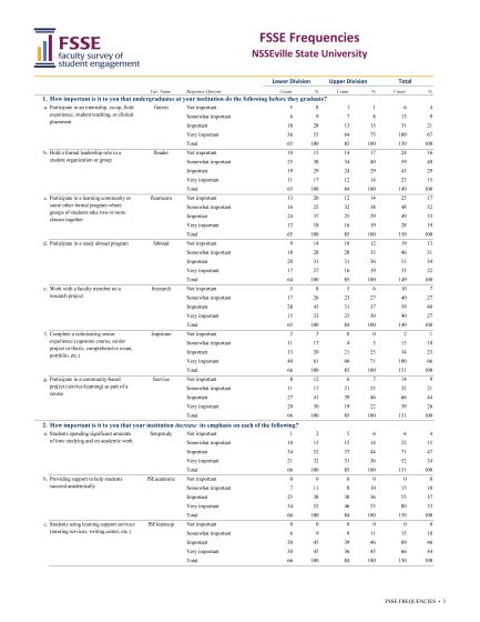
FSSE Frequencies
The Frequencies report contains results for all survey items except demographics, broken down by the class level of the students taught by faculty respondents.
FSSE Frequencies Report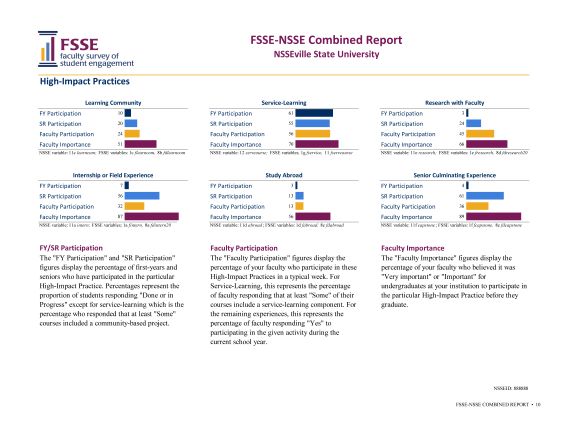
FSSE-NSSE Combined Report
For institutions that participate in both NSSE and FSSE in the same or a concurrent year, the Combined Reports show item by item comparisons of student and faculty responses.
FSSE-NSSE Combined Report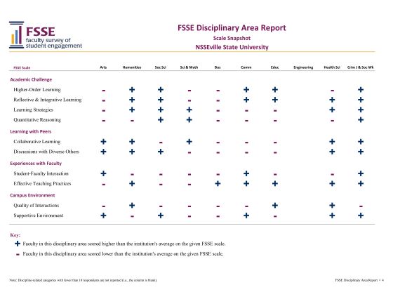
FSSE Disciplinary Area Report
This report allows for comparisons of faculty responses across groups of related disciplines within individual institutions. Results include frequencies of individual items as well as comparisons of FSSE Scale score comparisons of faculty in disciplinary groupings compared to the institution's overall average score.
FSSE Disciplinary Area Report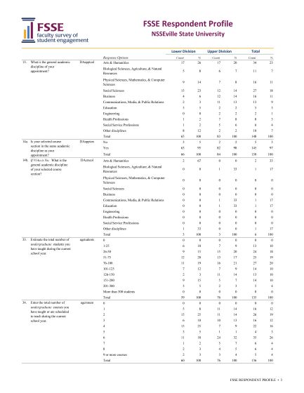
FSSE Respondent Profile
The Respondent Profile describes respondents by demographic features, academic discipline, number of courses taught, years of teaching, etc.
FSSE Respondent Profile Report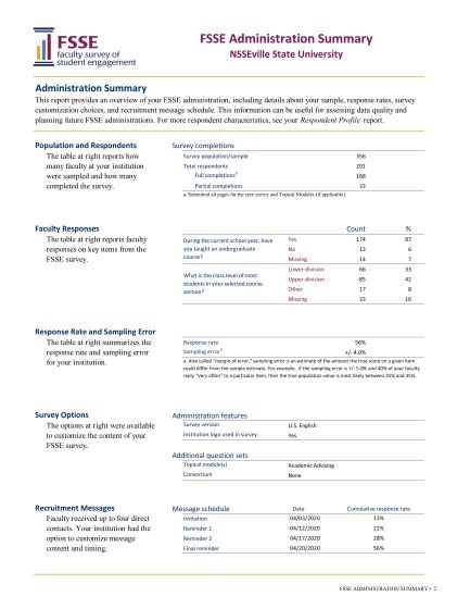
FSSE Administration Summary
This report provides an overview of administration details, including information about NSSEville State's sample, response rates, survey customization choices, and recruitment message schedule. Institutions often use this feedback to assess data quality and in planning future FSSE administrations.
FSSE Administration Summary Report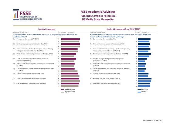
FSSE Topical Module Report
If applicable, the Topical Module reports detail how many and what percent of respondents chose each response option for all items, item numbers, and variable names in the Topical Module. See Topical Module options.
FSSE Topical Module Report